
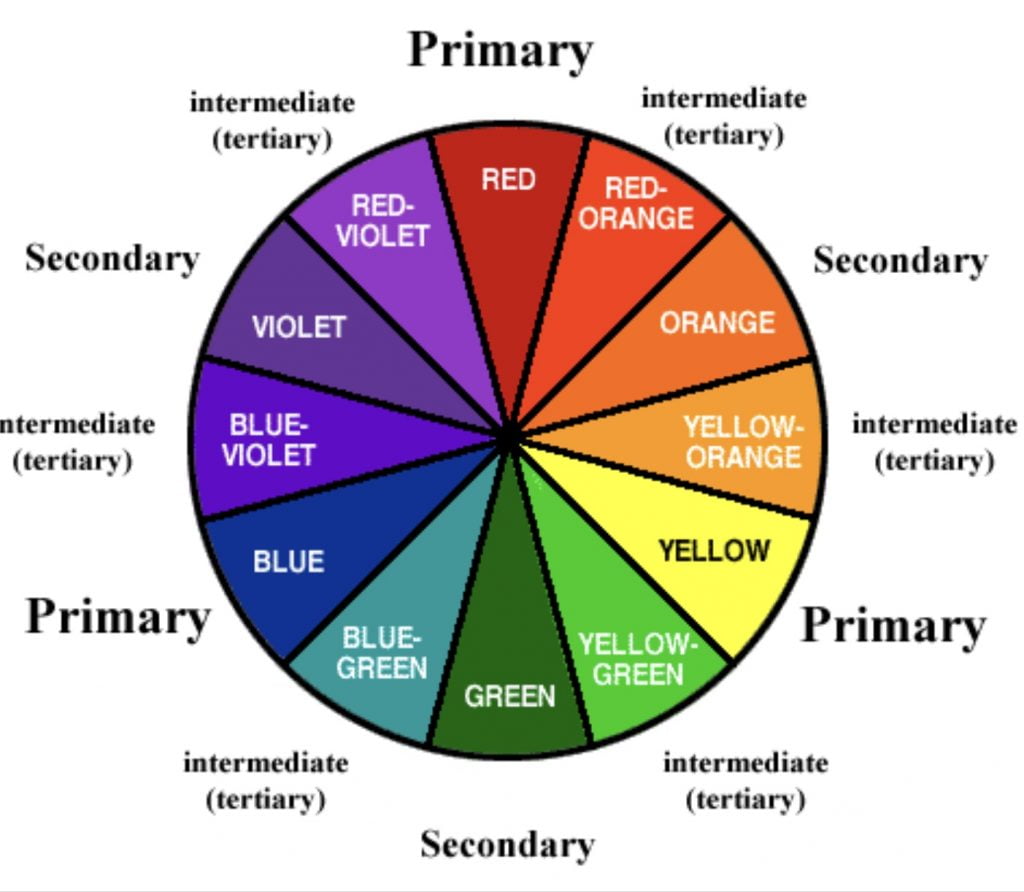
A colour wheel is a simple but powerful tool for an artist. Learning how to use the colour wheel effectively can boost your colour coordination, create contrast and even set a specific mood and style. The traditional colour wheel was created back in the 18th century and is made up of the three primary colours; red, blue and yellow.
Primary colours are the base colours that blend together to make all of the other colours in the spectrum. You cannot create primary colours from any other colour. Secondary colours are the second set of colours created from the primary ones. For example; if you mix blue and yellow, you get green; if you mix red and blue you get purple; yellow and red equals orange. The next layer on the wheel are called tertiary or intermediate colours. These are created by mixing one primary colour with one secondary colour. For example, yellow mixed with green makes yellow-green, an in-between shade of the two (refer to above image).
A colour wheel shows you the full colour spectrum and allows you to see which colours are ‘complementary’. You’ve heard the phrase “opposites attract?” Well that comes partly from the colour wheel. Colours which sit opposite to each other on the wheel are called complementary colours. Yellow and purple, blue and orange, red and green. These pairs are widely accepted as successful matches to be used in all kinds of design projects. The complement of any primary colour is always made by mixing the two other primary colours. For example, to find the complement of blue you mix red and yellow, which makes orange.
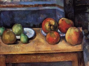
Artists throughout history have used complementary colours to create amazing effects. For example, in one of Cezanne’s famous paintings ‘Still Life Apples and Pears’ the shadow of the red apples appears to contain a little blue-green. This use of a complementary colour creates luminosity and gives the effect of a shadow.
Colour itself is created from white light. White light from the sun is a mixture of colours, each with a different frequency. A prism splits white light into a spectrum of colours: red, orange, yellow, green, blue, indigo and violet. Natural light is slightly different to the colour on a colour wheel. Our eyes only detect three colours. Not the three primary colours but red, green and blue instead (almost!). Combining these coloured lights is what creates other hues. By mixing red light and green light, for example, we can see yellow. If all three are mixed together we see white light. Objects absorb and reflect light differently. A leaf reflects green light, all the other colours are absorbed and so are not detected by our eyes. Have you ever stared at a block of colour for a minute or so? If you have and then look at a white paper or wall, you will have briefly seen a mimicked block in its complementary colour. Which just proves these pairings aren’t a man made theory, they are nature’s choices. There are many other types of man made colour models, such as RGB and CMYK. These are used in various places including software packages like Photoshop and Illustrator.
Colour is so important in our lives and evidence has shown it to be a huge mood regulator. Yellow is supposed to represent hope, which is possibly why one of my favourite charity’s Marie Curie use the daffodil as their logo. Green is meant to be extremely calming, which is why you often find it on the walls of various medical practises. Purple is thought to make you want to buy things and red makes you hungry!
The colour wheel is great for choosing beads and embellishments which complement each other. We’ve got 1000s of beautiful coloured goodies in-store and online, with so many shades to complement each another. Check out our many colours by clicking here.